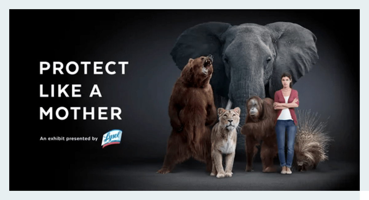
There’s nothing more eye-catching than a well-placed visual on a page dominated by textual content. The same can be said for ads — if you want your ad creative to stand out, there’s no better way to do so than by using compelling visuals and unique imagery. Ads that captivate and inspire the viewer are ads that convert.
Discover some of the best visual storytelling tricks to put to use in 2022.
What is visual storytelling?
Visual storytelling is a content marketing strategy that focuses on images and videos to tell a story, rather than the more conventional means: static text.
The appeal is quite obvious — in an era of oversaturation and diminishing attention spans, text just doesn’t cut it anymore. Advertisers have mere seconds to impress their audience and make a lasting memory, and there’s simply no substitute for emotive, thought-provoking visuals.
Don’t let the “storytelling” part fool you. You no longer need words to tell a story, especially not online. In fact, it’s more effective to show rather than tell your audience what you’re all about.
Do’s and don’ts of visual storytelling
While visual storytelling is the perfect vessel to elicit an emotional response, that doesn’t mean you should just cram every interesting image you find into your ads.
There are a few things to keep in mind when employing visual storytelling techniques in your marketing strategy. First and foremost, don’t clutter your creatives with more visuals than you really need. The more details there are in your ad, the less likely the viewer is to spot them, and your core message becomes diluted. Keep it clean and simple.
Another major don’t of visual storytelling is using stock photography. Stock photography tends to lump audiences together, regarding people as generic and interchangeable. Treat your audience like the unique group of people they are. Only by using specific, thoughtful imagery that is relatable to your target audience can you establish an emotional bond.
So, get personal and make visual storytelling feel familiar to your target audience. It needs to evoke feelings of trust, confidentiality and closeness. That’s why your ads need to depict people who resemble what you expect your audience to look like, enjoying activities that correspond to their interests.
However, visual storytelling also needs to feel real, which means that the activities and scenarios you portray in your ads don’t always have to be pleasant. Using conflict, drama or dilemmas as storytelling devices can elicit just as strong of an emotional response from your viewers.
Finally, don’t forget to emphasize your unique selling point. Visual storytelling can’t be effective if you forget to include your product or service’s main qualities, at the forefront of your ad — but it can help you accentuate them.
Now, let’s move onto the visuals themselves: here are several visual storytelling tricks to employ in your 2022 ad campaigns.
1. Color vs. contextual contrast
What better way to highlight your unique selling points than to use the oldest visual trick in the book — contrast.
Using either color or contextual contrasts, you can delineate different portions of the ad and emphasize them separately. Color contrasts work best if you don’t use too many colors in the visual. The fewer there are, the better the contrast.

Contextual contrast has the same purpose: accentuate the focal point of the ad. However, rather than using colors strategically, it plays with our perception of the image.

Playing with contrasts is not only visually relevant and useful but also quite interesting!
2. Emotions
When it comes to eliciting an emotional response from your audience, there’s no substitute for displaying emotion in your visuals. Show love, compassion, anger or any other emotion that complements your ad’s core message.

3. Composition
Ever hear of the rule of thirds? It states that our eyes are drawn to specific points on an image. By splitting the image using two horizontal and two vertical lines, you reveal the intersections of composition where audiences unconsciously focus.

4. Symbols and metaphors
Hiding messages in plain sight gives your audience something to think about. Most people love a good riddle, but only if they can solve it fast. In other words, give your audience a challenge but not an overly difficult one.

5. Character illustrations, comics and cartoons
Illustrations and cartoonish designs give you an opportunity to stand out from the crowd. They’re an excellent way to fill empty space while also showcasing your unique style.

6. Memes
Memes are unavoidable these days, so it comes as no surprise that you can find them decorating ads and forming visuals. Visuals that embrace meme culture work best on platforms where memes are abundant and for younger audiences. Memes allow audiences to feel as though they are in on the joke and therefore, your product or service.

7. Secret messages
Easter eggs are a common concept in TV shows, movies, video games and even ads. Finding secret messages and hidden meanings in any shape or form is a rewarding process that customers and clients love to take part in.

8. Dynamic photos
Just like static text doesn’t offer much in the way of excitement for the viewer, so do photos that lack dynamics.
Images with any lack of unpredictability aren’t a cause for excitement. Take a look at the following ad. There’s quite a difference between an ad showing a complete action and a dynamic photo that remains in a state of action.

Bottom line
A picture is worth a thousand words — and thousands of dollars in ad revenue, if you do it right. Using the visual storytelling tricks we laid out here for you today, you’ll be able to make ad creatives that don’t go unnoticed.
Telling a story in the shortest amount of time while stirring emotions is an art form in and of itself. It will take time to master, but when you do, you’ll be creating ad visuals that leave a long-lasting effect on the viewer.


